This week we’re announcing several new features on the calendar page, two of which are explained in this post:
- A customization option lets you choose what data is visible
- Availability of five new metrics (including training load)
Read on for details of these exciting new features.
Data customization
You can now customize the data you want to see in your yearly, monthly and weekly views by clicking the “Customize” button in the upper right corner of the page.
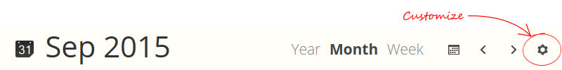
When the customize dialog appears you’ll see two options:
- Totals
Select which data you want to appear in the sidebar total blocks and any other places on the page where totals are summarized such as monthly and weekly totals within the calendar. - Sport totals
Select which data you want to see for totals summarized by sport. You can also choose whether you want to see “just the numbers” or a pie visualization.
For each of these options you can select the visible data by dragging the item into one of the first four spots. You can also choose the order by rearranging the top-four items.
Note that in some screen resolutions (tablet portrait/landscape and smartphone) certain data fields are hidden to ensure the calendar space is fully visible. You can customize exactly which you want to see by dragging around the items until the layout is exactly like you want.
New data metrics
With the ability to customize the data fields in the calendar, we’ve also added five new metrics:
- Elevation gain
The total elevation gained during the period. Available as a period total or per-sport summary total. - Effort
The total effort put out during the period. Available as a period total or per-sport summary total. - Performance
Your performance level at the end of the period, including any future planned but uncompleted workouts, determined by the training load model. - Fitness
Your fitness level at the end of the period. - Fatigue
Your fatigue level at the end of the period.
Of course, you can also select from the previous metrics: Workout count, Distance, Time, and Calories.
For any of these metrics, click the totals block in the sidebar to view the trend chart for the metric. Metrics that are calculated as a total for the period are shown as a bar chart; the three training load metrics show the relevant daily chart for the trend period. The current period is highlighted in a darker color while past and future periods are shown in a lighter color.
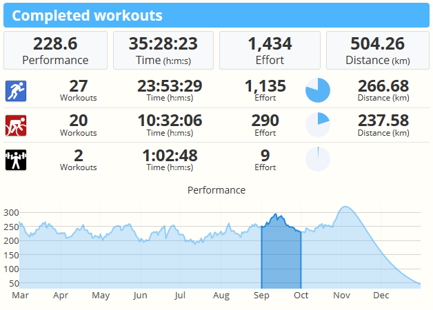
You can also quickly navigate to a new period by clicking the segment in the chart. This makes jumping forward or backward as easy as one click.
Multi-period analysis
One final tip: You can perform analysis of your workout volume, training, and performance over multiple periods by using your browser’s “Open in New Tab” or “Open in New Window” option to bring up more than one view of different parts of your history. If you’ve got a large desktop display, this is a great way to plan future workout training plans while looking at data from past seasons.
One of our favorite techniques is to bring up today’s monthly view in one browser window, and last year’s calendar in another, then tile the windows side-by-side. You can plan your training session in the monthly browser, while referring to the yearly view next to it.