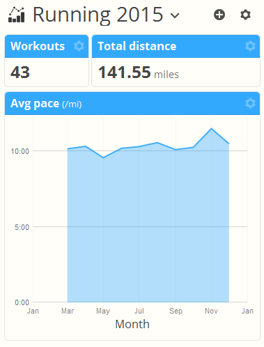
When you first visit the Analysis page you’ll see a simple layout with some basic information on your workout history for the last 12 weeks. As you will learn here, this is only the beginning of the kinds of analysis reports you can do in SportTracks!
Analysis view basics
The analysis view is made up of three sections listed from top to bottom:
- Saved report selection and page buttons
- Report data filtering/search
- Report chart/data “widget” panels
We’re going to start at the bottom by customizing one of your existing widget panels.
Customizing a widget panel
Every widget panel in your analysis report can be customized.
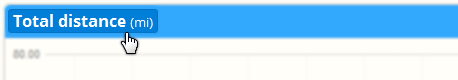
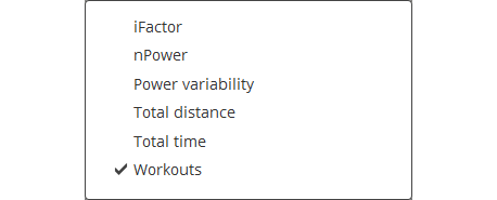
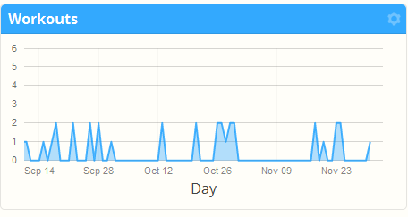
With most charts you can quickly select different data and grouping options by clicking the labels directly in the chart. For example, to show a daily line chart of your total workout count, click the panel header to select “Workouts”…
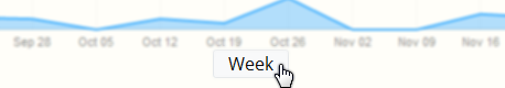
…then click the word "Week" at the bottom of that widget and select “Start > Day”
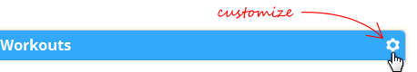
If you want to make more advanced customizations to a panel such as selecting a different chart type, or chart size and grouping, click the customize button in the panel header:
Take some time to explore the options of the different charts in the customize page, or read the detailed walk through in the (link: analysis charting and metric options) blog post.
Customizing the report layout
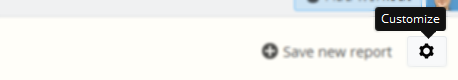
To add new widget panels click the page customize button at the top right corner of the page:
The page customize dialog lets you add and remove widget panel rows and change the number and arrangement of columns. There is no limit to the number of rows you can have in a report and each row can have one to six columns in 11 different layout styles. The customization features should be self-explanatory:
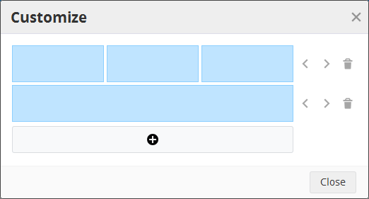
Existing widget panel options are preserved as best we can; new rows/columns will be empty until you select the chart options for the panel.
Filtering report data
Once you’ve organized a report layout to your meet your needs you probably want to pick which workouts are showing in the report. There are two ways you can do this: with the “Search by” button or by selecting ranges directly in the charts.
For example to show only running workouts click the “Search by” button and select “Sport”, then click the running icon:
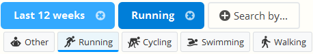
To change a filter, click the named filter and select a different option. Some filters like date, distance and time have range sliders you can use. To clear a filter, click the “X” button in the named filter.
When you’ve selected the workouts you want to display, you can click the currently active named filter to hide the selection panel and save some vertical space.
Filtering report data by chart selection
Some charts such as the line, bar, and pie also let you filter your data by clicking data directly in the chart. For example add a pie chart grouped by sport, and click each slice to filter by that sport type. You can also select ranges of data by clicking and dragging. Watch how your charts are updated interactively!
Saving performance reports
Any customizations you make to the layout, chart options and data filtering will be automatically saved in your browser settings and restored when you return to the Analysis option.
If you find there is a report you keep coming back to, you may want to create a saved report. There is no limit to the number of reports you can save; create as many as you like.
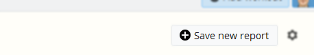
Click the “Save new report” button to copy the currently viewed report to a new saved report. You can copy the default auto-save report or clone an existing report.
Once the report is saved you can select it from the list:
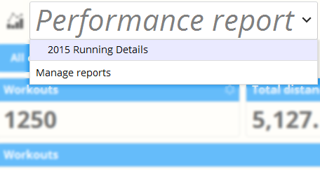
From the same menu you can also manage your reports to rename or delete them.
If you’re viewing a saved report and you make changes to the layout or filters a “Save changes” button appears by the report name. To revert to the saved report just refresh the page or select a different saved report and your changes will be discarded.
Finally you may notice when you view a saved report the browser URL changes to indicate the report. You can use this URL as a bookmark in your browser or on your mobile phone homepage to instantly jump to the selected report. It’s a powerful feature especially for coaches who want to see a particular athlete’s data.
Layout considerations
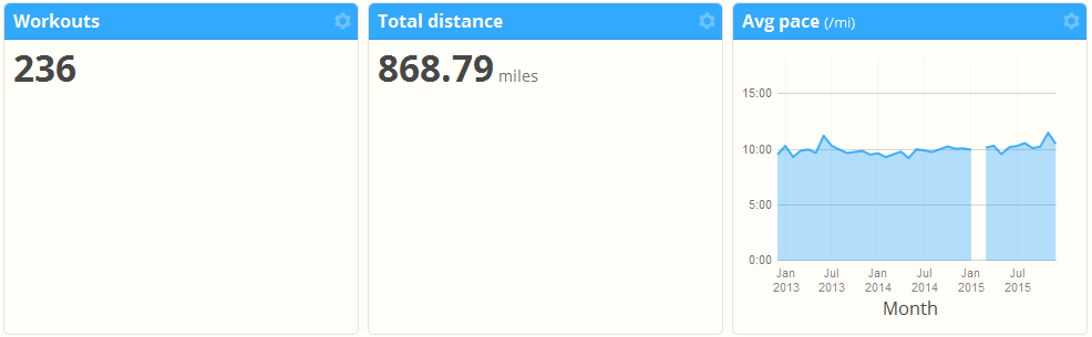
As you customize your report view, you’ll begin to notice that some widgets have different natural heights depending on how much data is visible. We won’t prevent you from making an ugly layout that wastes a lot of screen space:
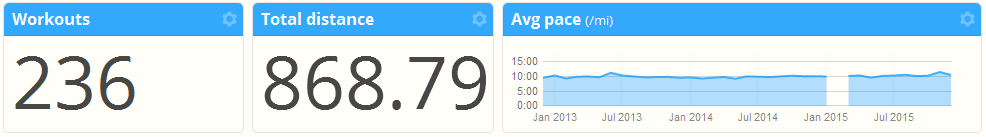
So you’ll want to experiment with different widget types and sizes to optimize your layout:
If you’re using SportTracks on a variety of devices with different screen sizes (such as desktop vs. smartphone) you may even want to make device specific reports. This way you can have fewer columns on your mobile phone and still see the important data you care about. The image below shows the same data as above, tailored for a mobile phone vertical orientation:
You can combine this technique with the report URL to drop shortcuts on your phone homepage so your custom mobile reports are just one click away.
~Enjoy