The analysis page in SportTracks gives you powerful tools to understand your training history and performance. To get the most from this page you’ll need to understand the available charts and workout data described in this article.
Workout data basics
For the purposes of the analysis page, your workouts have two kinds of data:
- Categorization: Sport, Date (year, month, week, day), Distance and Time range
- Value metrics: Distance, Time, Speed, Pace, Avg Heartrate, … and more …
In general you can use categorization data for grouping, summarization and series options, while value metrics are used for charting the actual workout values. Makes sense, right?
We currently offer 16 value metrics listed below:
Basic Metrics
- Total workout count
- Average workout count
- Total distance
- Average distance
- Total time
- Average time
Performance Metrics
- Average speed
- Average pace
- Elevation gain
- Average heart rate
- Aerobic efficiency
Cycling Metrics
- Average cadence
- Average power
- nPower
- iFactor
- Power variability
Different display types allow different metrics (and categorization) as descried in detail below.
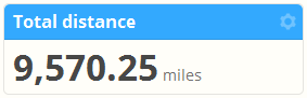
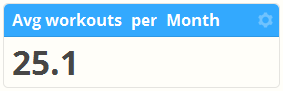
Summary value
The simplest display type is the “Summary value” which shows a single value in the panel:
The summary value type can display all value metrics. If you select average workouts, average time or average distance you can also select the summary per option, illustrated below:
The size option allows you to set the font size to scale with other charts in the row, or to adjust for mobile / desktop resolution.
Line chart
The line chart shows a single value metric over a time period based on the workout start date. You can choose to plot a point every year, month, week or day with the group by option. For metrics which are a total sum, the group metric will also affect how the data is totaled up.
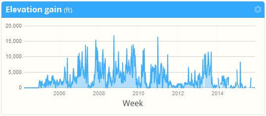
The size option allows you to set the vertical height of the chart.
Bar chart
The bar chart shows a single value metric over time or grouped by the Sport, Time, Distance or Day of week category.
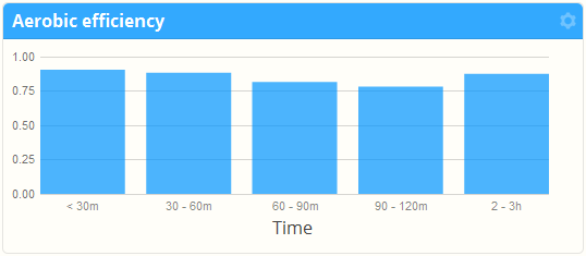
The size option allows you to set the vertical height of the chart.
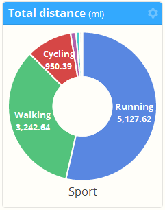
Pie chart
The pie chart shows a total value metric grouped Sport, Time, Distance, Day of week, Month or Year.
The size option allows you to set the vertical height of the chart.
Scatter plot
The scatter plot allows you to select two values to display on the x and y axis to show relationship between them. You can also select a categorization series.
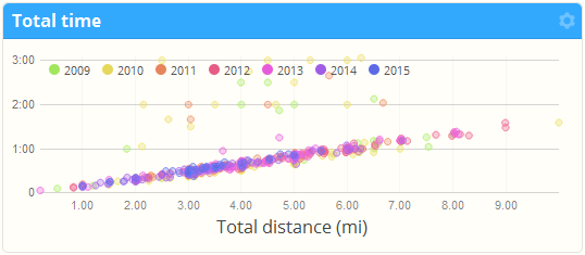
If you use a heart rate monitor or a cycling power meter the scatter plot can provide good insight of your performance related to different types of workouts.
The size option allows you to set the vertical height of the chart.
Bubble grid
The last chart is one we put in for testing but decided to release it because – why not!
The bubble grid is similar to a scatter plot but instead of showing value metric relationships you can explore categorization on two axis (rows and columns). The bubble color and size is determined by the value metric you choose.
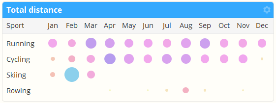
Because the number of rows (and therefore, the panel row height) may be variable based on categorization, this is a weird one. You might want to put it at the bottom of your report in a row by itself.
~Enjoy